Visualization of DE results
Still in R, we need to transform the raw discretely distributed counts in order to be able to perform clustering and other types of visualizations. As several transformations are available we will need to chose the one that fit best to our data. For example, the rlog transformation method that converts counts to log2 values is better than the old variance stabilization method when the data size factors vary by large amounts. The assay function is used to extract the matrix of normalized values.
> rld <- rlog(dds)
> vsd <- varianceStabilizingTransformation(dds)
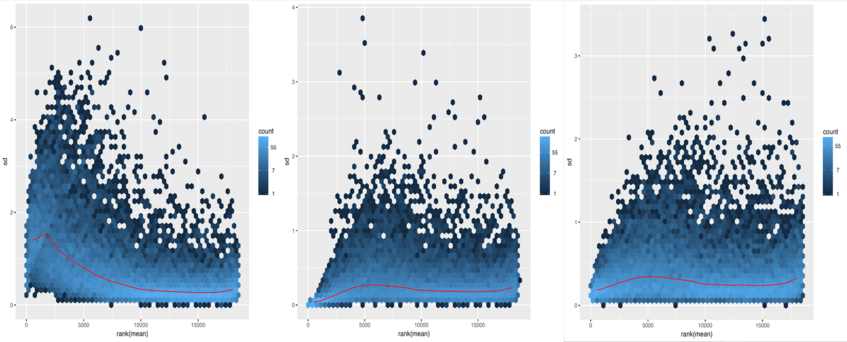
We can examine the effects of transformation on the variance. We should further use the transformation with the lowest variance (the most flat curve across read counts) for our interpretations. Let's have a look at plots showing the standard deviation across all samples against the mean counts using the different methods for transformation.
> library("vsn")
> library("gplots")
> library("RColorBrewer")
First, the shifted logarithm method:
> notAllZero<-(rowSums(counts(dds))>0)
> pdf("SdPlots.pdf", width = 8, height = 10)
> meanSdPlot(log2(counts(dds,normalized=T)[notAllZero,]+1))
Second, the regularized log stabilisation:
> meanSdPlot(assay(rld[notAllZero,]))
Finally, the variance stabilisation:
> meanSdPlot(assay(vsd[notAllZero,]))
> dev.off()
To explore a count table, it is often instructive to look at it as a heatmap. Below we aim to produce such a heatmap from the transformed data.
> select_genes <- rownames(subset(resOrdered, padj < 0.001))
> mat <- assay(rld)[select_genes,]
> pdf("heatmap.pdf", width=8, height=10)
> heatmap(mat)
> dev.off()
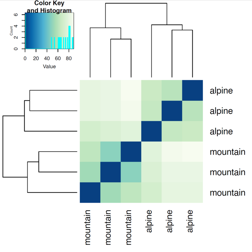
Another use of the transformed data is sample clustering for example based on Euclidean distances between the samples as calculated from the regularized log transformation.
> distsRL<-dist(t(assay(rld)))
> mat1<-as.matrix(distsRL, dimnames= colnames(distsRL))
> hmcol<-colorRampPalette ((brewer.pal (9, "GnBu")))(100)
> pdf("heatmap2.pdf", width=8, height=8)
> heatmap.2(mat1, trace="none", col=rev(hmcol), margin=c(13,13))
> dev.off()
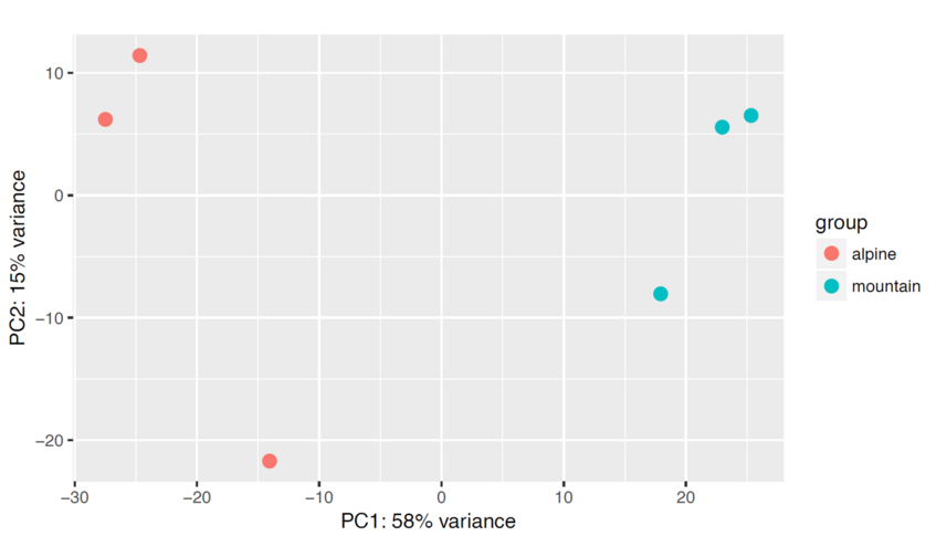
We can draw also a PCA plot of the samples from the Euclidean distance. This type of plot is useful for visualizing the overall effect of experimental covariates and batch effects. One could use either the regularized log transformation or the variance stabilized transformation.
> pdf("PCA.pdf", width = 8, height =8)
> p=plotPCA(rld)
> names=colnames(rld)
> print(p)
> dev.off()
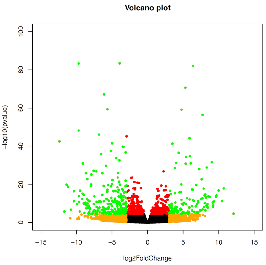
Finally, we can plot our results as a Volcano plot. We would normally use a level of 0.01 for padj and 1.5 for log2FC, but as we have a lot of genes that are differentially expressed in this case, we go for a more stringent level.
> pdf("Volcano.pdf", width = 8, height = 10)
> with(res, plot(log2FoldChange, -log10(pvalue), pch=20, main="Volcano plot", xlim=c(-15,15), ylim=c(0,100)))
> with(subset(res, padj<.001 ), points(log2FoldChange, -log10(pvalue), pch=20, col="red"))
> with(subset(res, abs(log2FoldChange)>3), points(log2FoldChange, -log10(pvalue), pch=20, col="orange"))
> with(subset(res, padj<.001 & abs(log2FoldChange)>3), points(log2FoldChange, -log10(pvalue), pch=20, col="green"))
> dev.off()